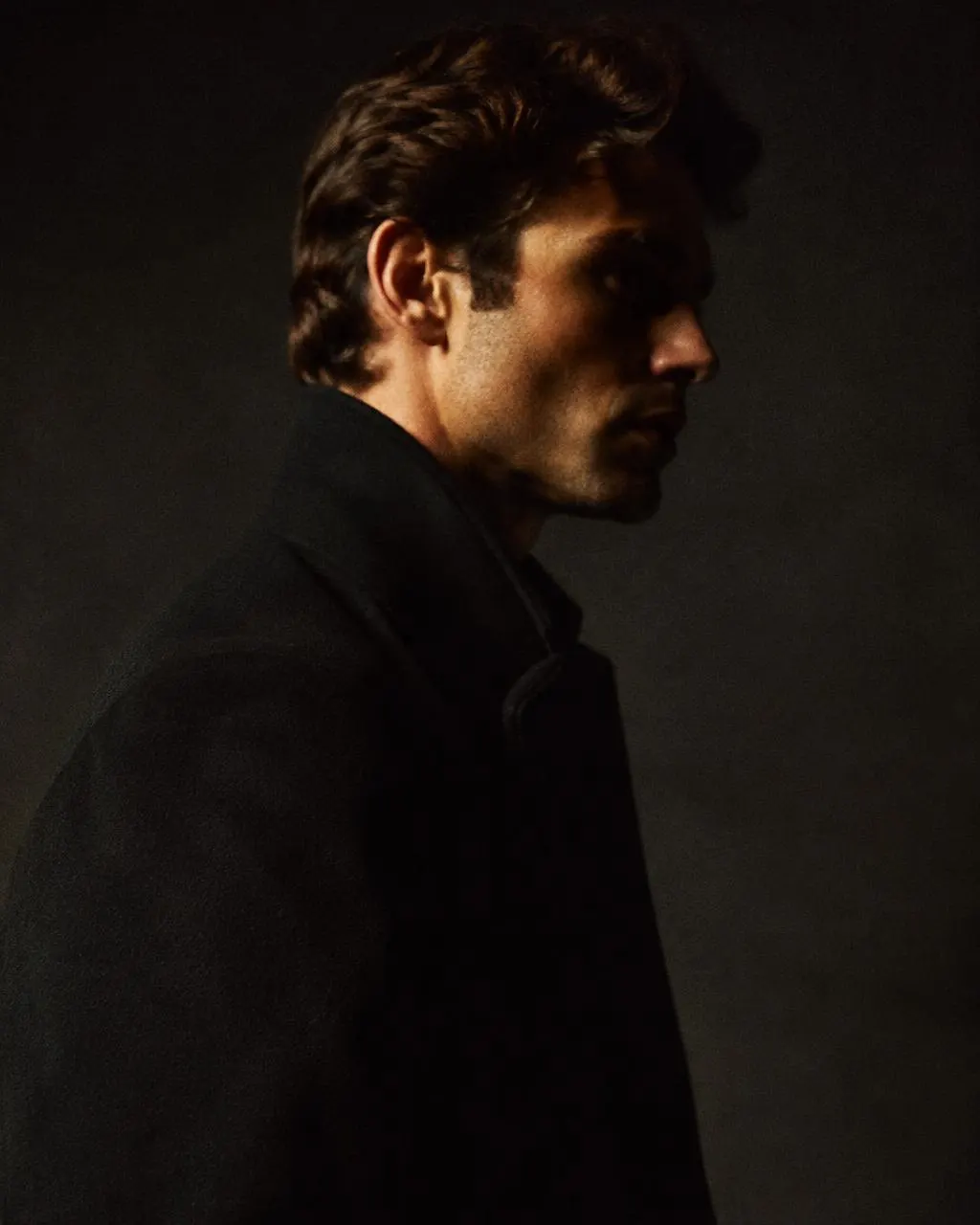
North Meridian
2023PartnerCreative LeadFilm & Culture
Phase 01 — Foundation
Luxury expressed through proportion, typography, imagery, spacing and restraint.
01Colour
Warm neutrals carry the experience. Oxblood is a signature, never a fill.
Primary Ink
#111111
Text · dark surfaces
17.0 : 1 on Bone
Primary Bone
#F2F0EB
Light surfaces
17.0 : 1 with Ink
Stone
#77746E
Labels ≥ 12px caps only
4.0 : 1 on Bone
Oxblood
#8B2826
Accent · < 2% of surface
8.3 : 1 on Bone
Pure White
#FFFFFF
Rare highlight
18.9 : 1 with Ink
02Display typography
Archivo, condensed through its width axis. Tight tracking, deliberate line breaks, always left-aligned.
Display XL · 52–144
Display L · 44–104
Section · 36–76
Editorial · 28–48
03Supporting text
Lead · Instrument Sans 20–26
We take a long view on the companies we back, and a close view on how they are made.
Body · 17–19
Body copy uses the secondary text tone on light surfaces for comfortable long-form reading while keeping AA contrast. Measure is held near 65 characters.
Label · 12–14 caps
05Grid compositions
12 columns, 1360px max. 72 / 32 / 20px gutters. Asymmetry over symmetry.
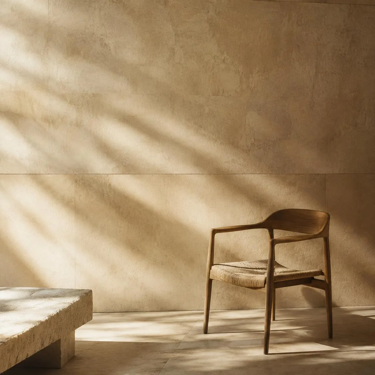
06Image treatments
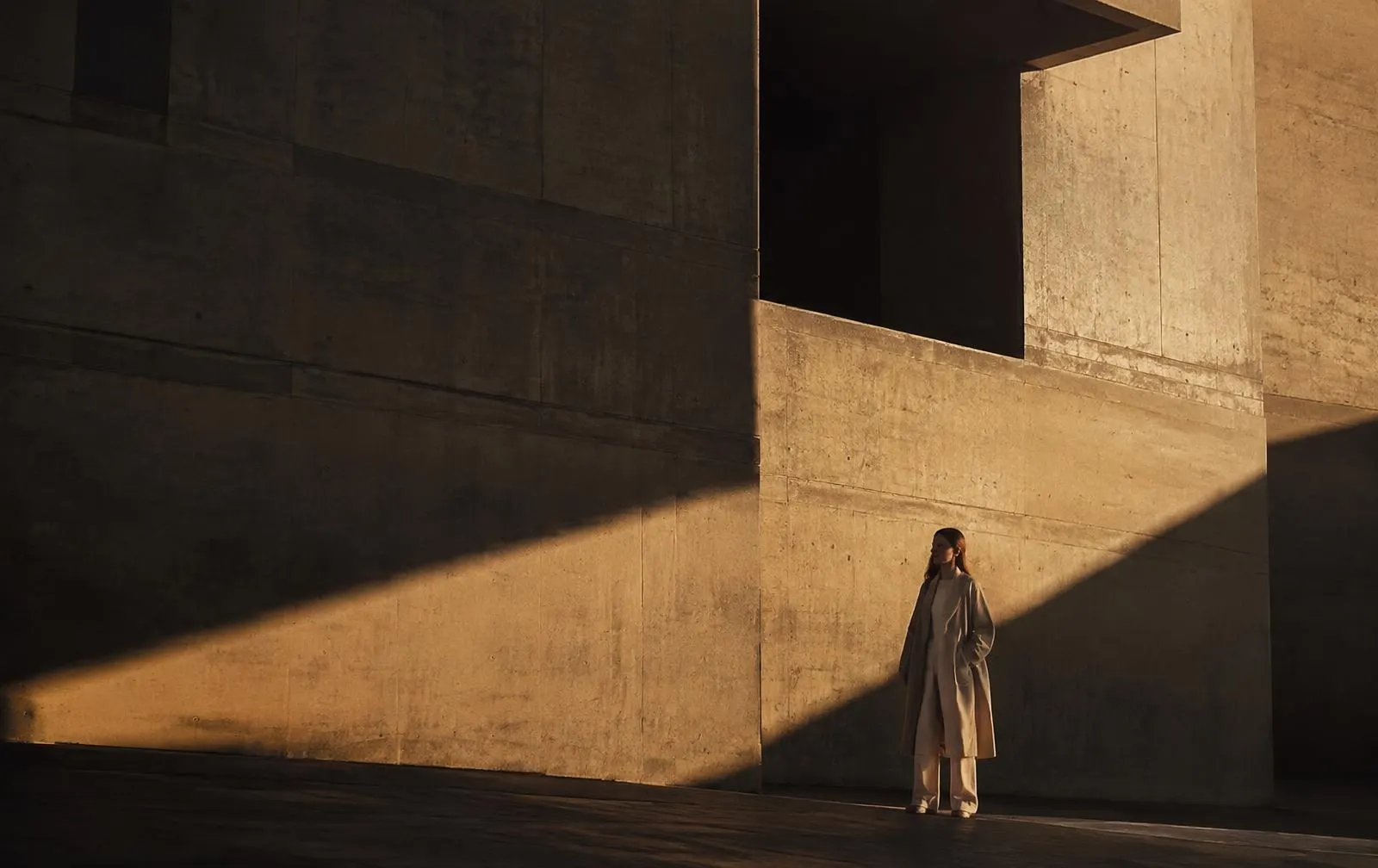
Distinctive ratios. Slow, subtle hover. Images may break the grid when it earns it.
07Surfaces
Light · Bone
Dark · Ink
08Hover & dividers
Placeholder brands — fictional, for layout only.
09Spacing & breakpoints
8px foundation. Sections breathe at 72–160px vertical.
390
Mobile — 20px gutter · 4 col
768
Tablet — 32px gutter · 12 col
1440
Desktop — 72px gutter · 12 col